Controlling a super laser
Tein André
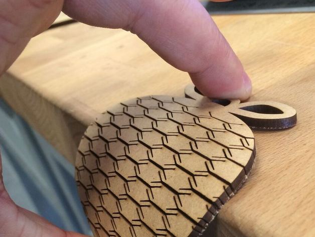
Today I had a workshop laser cutting, it turns out that it takes a pretty simple
input to make a very advanced laser cut exactly what you want.
Those cutters take a simple vector drawing as the input, you just add RGB-red
line to laser cut a line. The laser cutter is also capable of engraving, you can
do that by making the lines or pictures or anything you want in a grayscale. The
lecturer showed many possibilities of using laser cutting in projects and making
presents. Different materials are available to cut using a laser cutter such as
simple wood and also acrylic, but in theory you could cut anything with it.
After all kinds of technicalities the lecturer told us something very interesting, with a laser cutter
you can make wood bendable by adding small cuts that do not sever the wood completaly.
I hope to be able to use the skills that I picked up in the near future with our module project and
othe personal projects.
12 December 2018
The websites of my co-creaters
Tein André
![]()
Here is a short post about the websites that some co-CreaTers have made.
Lets start with the site of Ceder, she has made a well functioning website with wordpress.
First of it is very pink and it has some interesting. And one thing is for sure it works very well on
a mobile phone.
Second up is the website of Imke, she made her website all in html and css which is more of a challange.
there are only a vew things that she could improve, for instance that she could format the text so
that it would all look even better and more rounded.
And lastly the website of Ray, also coded in html and looking very nice. All the links work very well
and there is plenty of information about him on there. He is also the only one out of the three who
actually put up an emailadress so that you can actually reach him if you wanted to. And his website
works pretty well on a mobile phone it only acts a bit strange with pictures.
In conclusion
these three websites are pretty nice, but if I have to pic one as my favorite it would be
the website of Ray. This is because he does not have weird problems with formating and everything
just has a nice feel to it.
below you can also see a short overview.
| Categorie |
xxxTankstation |
Imke Verschuren |
Rayhan Bayuaji |
Overall score
(out of 5) |
3 |
4.6 |
4.2 |
| Last Post |
November 8 |
November 6 |
November 6 |
| Nr. of portfolio items |
3 |
3 |
6 |
| Connections |
not present |
Instagram link
Soundcloudlink |
e-Mail |
| Mobile performance |
Good |
do-Able |
Sufficient |
25 November 2018
Video project and final expo
Tein André
![]()
This was the last week of the module one of creative technolgy for me.
The last thing last thing on the agenda was a final exposition of what we had made in the past
weeks.
Parents and older years and other people related to the us (the students) in some way came to
take a look at what whe had been making, that also includes the video project I had made with
my group.
Although I was a bit nervous at first people responded really positively and I guess sometimes
you just have to trust that the product you made over the course of a couple weeks is good.
I also was really impressed with some of the other projects made, there were some terific posters
made for visual comunication and also some cool programs. But my favorite, and also my
weirdest experience, was an interactive video that was simultaniously a dating simulator.
...
it was an INTERESTING experience so to say.
7 November 2018
3D printing-Workshop
Tein André

To put it really blunt 3D printing is easy, 3d modeling on the other hand is imposible.
I really respect the people that made the models for all my favorite animated movies because it
takes a really long time to make even the simplest of things. For modeling you have two basic choices,
you either chose to use a CAD program and you get to use basic geometric shapes or you can use an
program that enables you to make organic shapes but that program is imposibly complicated and half of
the time it doesn't do what you expect it to do.
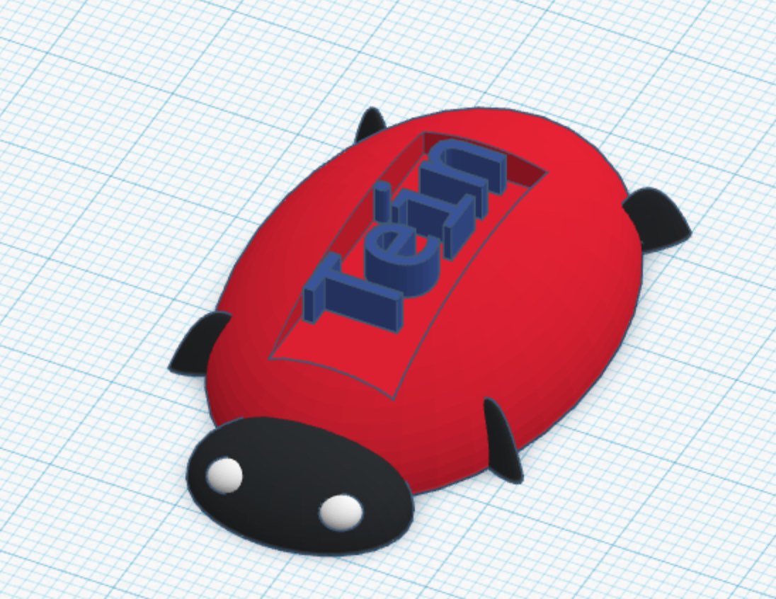
I had some difficulty but in the end I made the object you see in the picture.
17 October 2018
Website review of co-CreaTer
Tein André
Simply put this website is pink, pink … pink, I feel like
I’m forgetting something … oh wait pink and did I mention pink? It is
a nice website, not to cluttered with stuf and with a good layout.
That might be because of the fact that it was created in Wordpress. The website is based on
this template from Wordpress.
Ceder did change the colors and fonts but she kept the basic layout.
There isn’t too much high quality content yet I think that that
will come in the near future.
To close on a more positive note though, it is very easy to
navigate the website and it is nice.
Simply said well done Ceder.
The thing that I noticed while reviewing the website is all the things that could be done
differently in her website as well as in my own. Because some things I did differently myself, some
we "better" somethings are "worse". And I really noticed that a website's structure can get really
messy real quick.
16 October 2018
A stylefull website?
Tein André
As you are scrolling trough this webiste you probably notice
that it has been stylized in a certain way, righ?
That it looks pretty uniform. Let me tell you how I have
achieved that on a handcoded website.
First of all I used one stylesheet for almost all the pages
(exept for the slideshows on the photography page) so that
everything actualy uses the same style (and it saved me a
lot of work). What I did next to make it nice is that I looked
up a hex-color palette so that the colors that I used in
my css code would match nicely. For that I just used google
and there I came across
this color palette. The slideshow thing was an example
from w3schools
so I used that code (you can also find that back in the
comments of my code).
2 October 2018
Humanization
Tein André

For Visual comunication we had to create faces out of objects
and make a picture of that. Although the start was a bit
slow I did enjoy the making of those pictures (like the one
to the right here). Because for me it became more of a
challenge of how to make it out of light instead of "normal"
objects. I hope you like the results. (if you click the picture
it wil take you to the right place).
2 October 2018
Video project for We Create Identity [update]
Tein André
Here's where we are so far with our videoproject:
This week we have finalised our concept for our interactive video.
We have chosen to go with a detective game/movie that can end in several
different ways. If you chose the wrong options you might mis some valuable
information and accuse the wrong suspect of murder, try to avoid that.
Now that our concept has been finished we are focusing on
the actual final script of the story and the technical aspects like
camera-equipment and such.
I think it can be amazing and I hope it wil become even better.
26 September 2018
Long exposure photography
Tein André

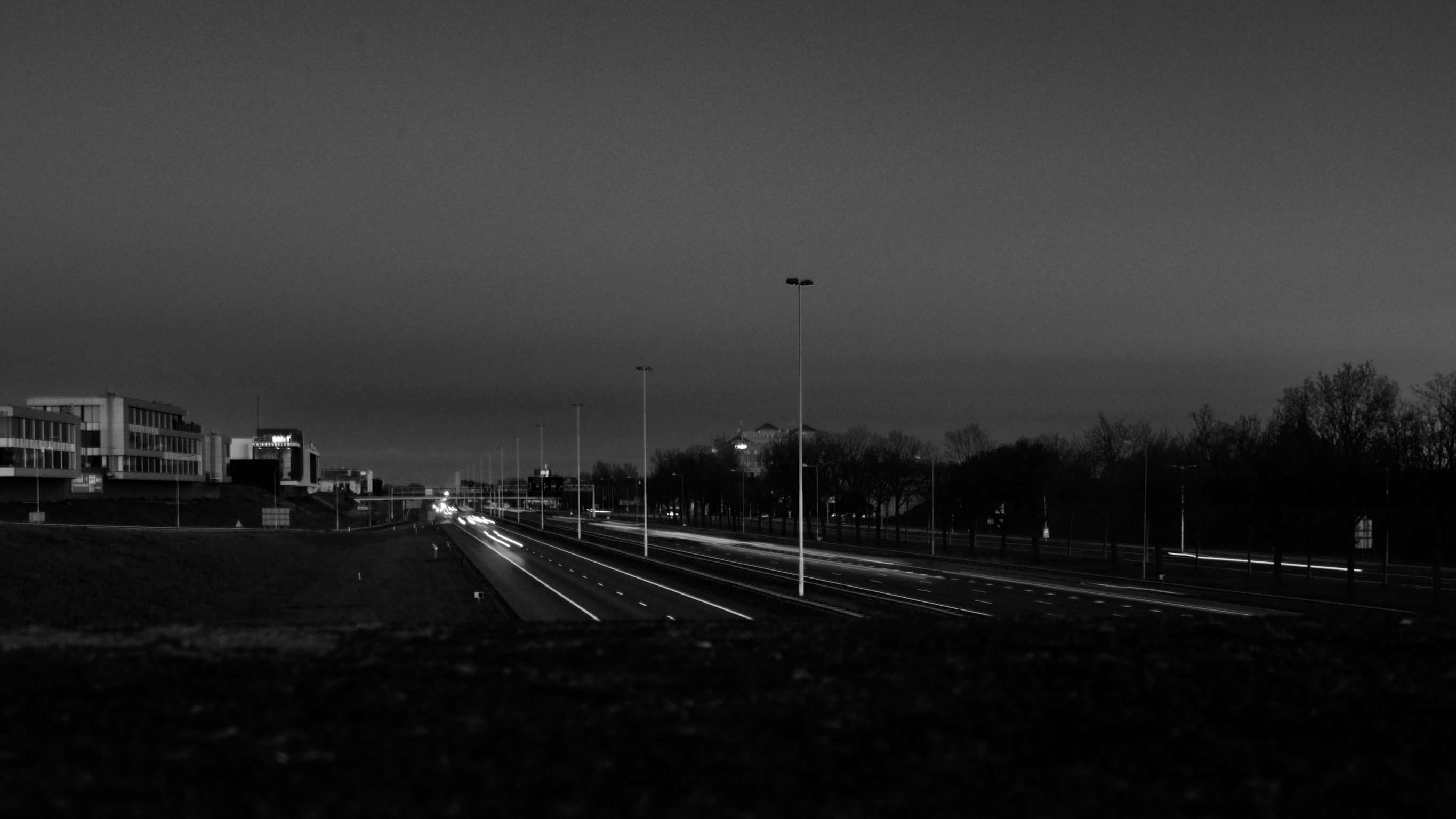
In the past few years I started to really get into photography and
I have started to experiment with some techniques. One of those is
long exposure photography. If you click the picture you can see some
more of that work.
26 September 2018
GOGBOT visit
Tein André


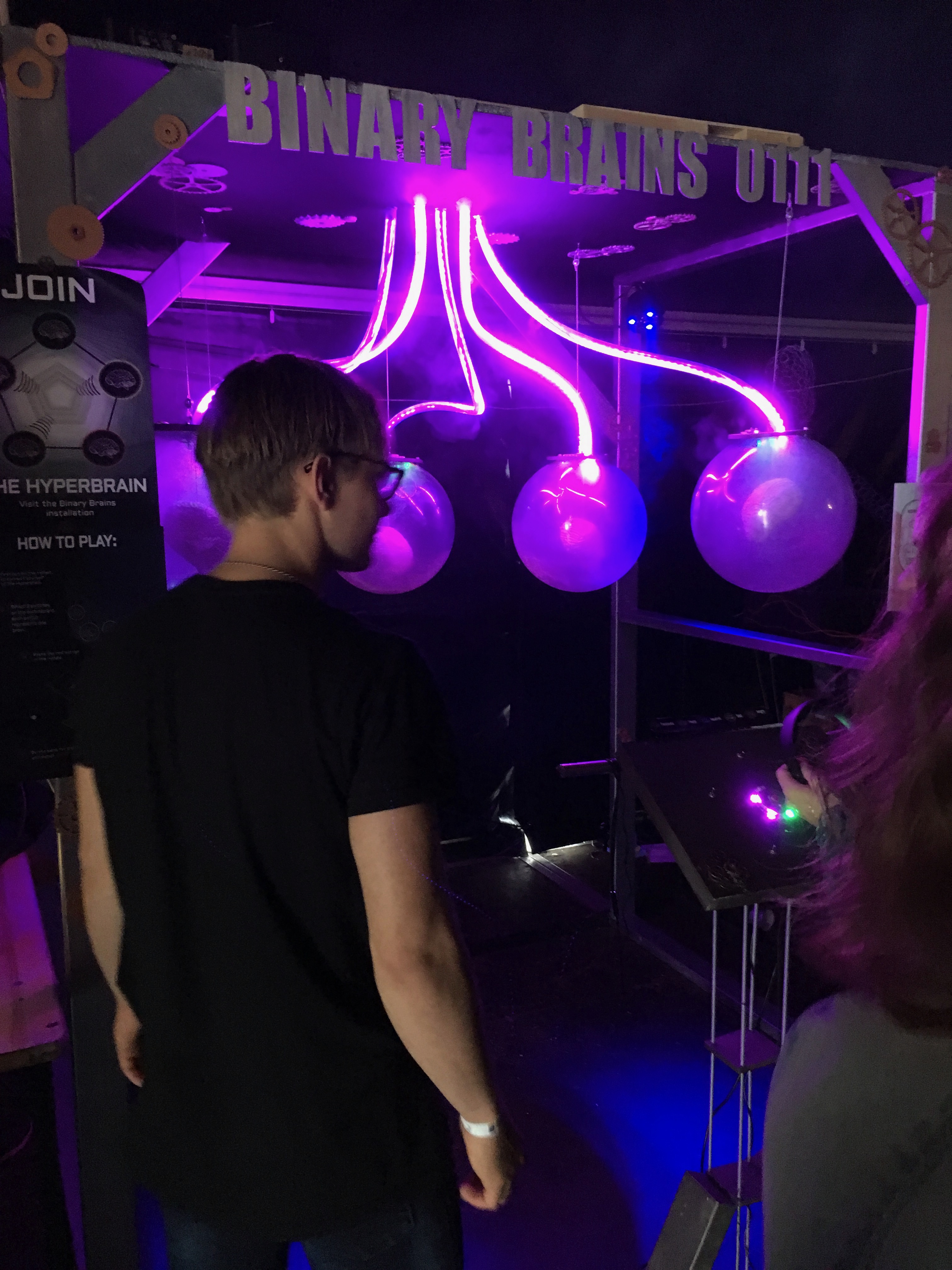
A little while ago I visited the Gogbot exposition in Enschede.
sadly it was raining a lot that day but luckily the expo was mostly inside.
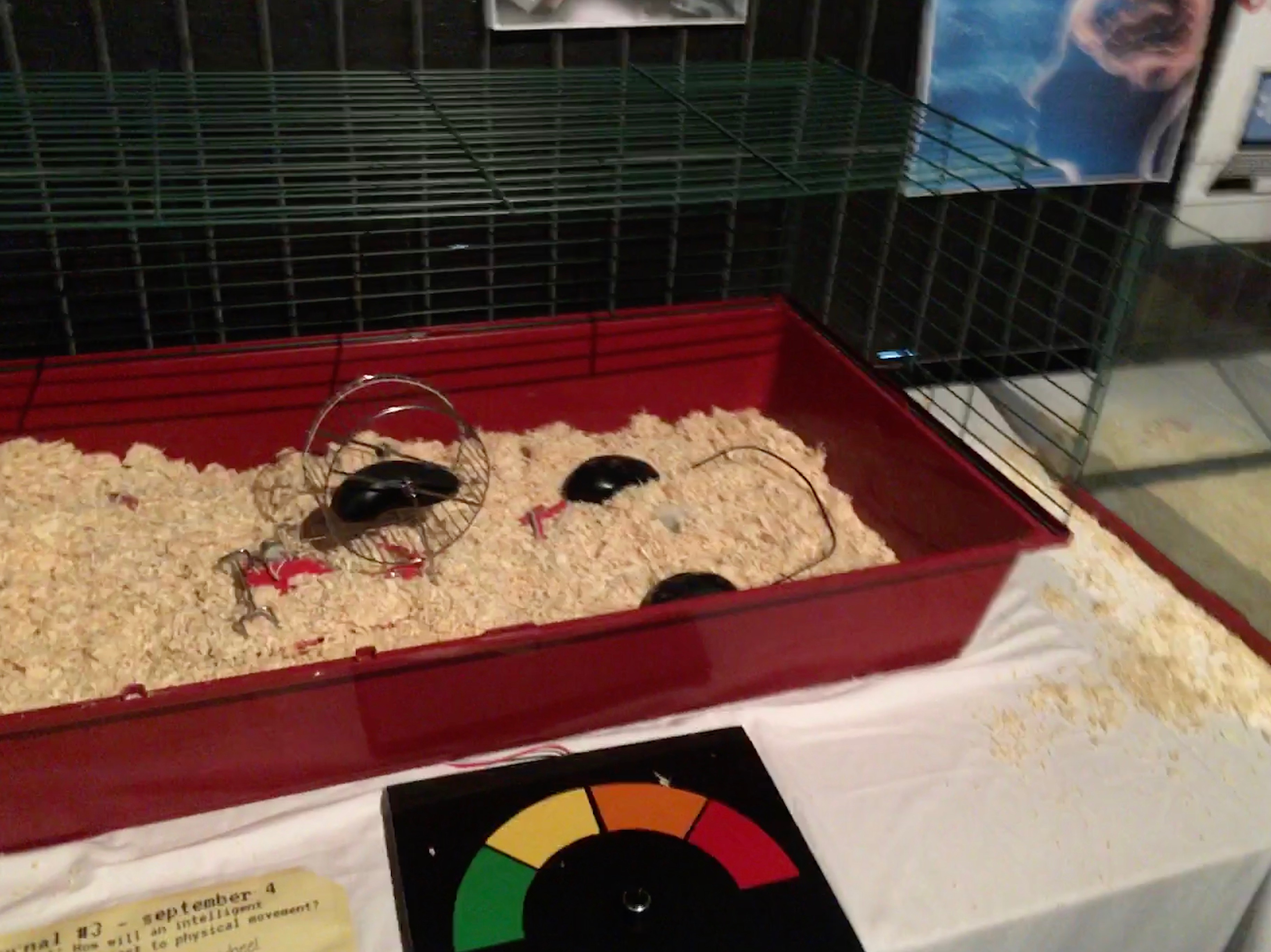
There were a lot of interesting installations there. For example there was
an installation that asked a crucial question for the future:
"what will happen if our tech develops a concience?".
Control Why? (the name of the project) got 1st place in the expo for
Creative technologie.
18 September 2018
Web Tech A.K.A making a website
Tein André
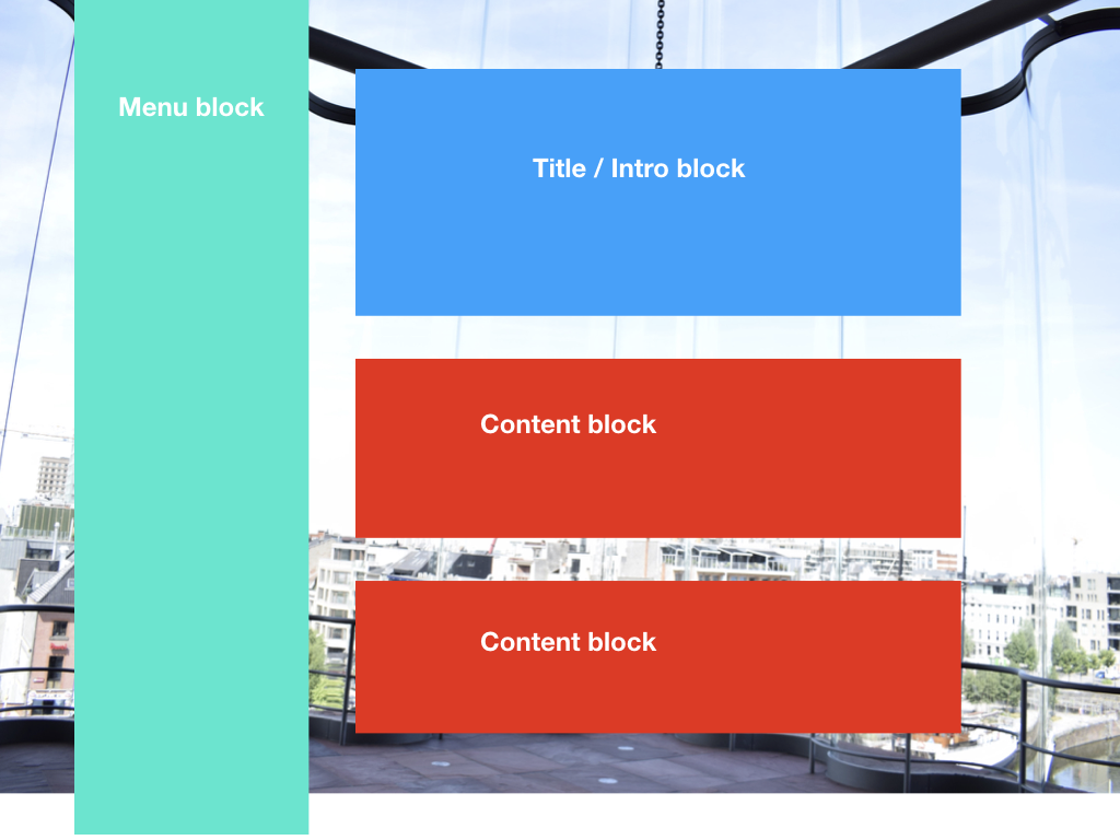
Here's a little insight into the making of this website.
First of all I would like to start by telling you that I hand-coded this
entire website, so there is no template or wordpress used.
I decided to do it this way because this gives me very precise control
over what is on my website and the knowledge of how exactly it is constructed.
Although I did take some inspiration from w3schools.com
and some other sources that my co-students looked up.
I also included a picture of my first design idea on the right here.
If you have an idea that I could incorporate in my website contact me.
(If you don't know how to contact me that's oke.)
18 September 2018
